Friday, February 28, 2014

For my Cute Little Nieces


Sending these Pixar cards to my cute little nieces.  Both cards are from The Art of Pixar Postcard box.  You can read my review at Amazon.ca (click if you find it helpful).
 
For more postal fun, visit with Beth at the Best Hearts are Crunchy for her Postcard Friendship Friday.


Thursday, February 27, 2014

A Quilted Garden

This quilt was gorgeous when I viewed it in person.  The colours were more vivid that this image would have you believe.  It is titled: My Garden of Dreams by Mryle Lehman Tapungot, Cagayan de Oro, Philippines.  It is in the collection of the Museum of the American Quilter's Society. 

A larger image is available at this link.

This is on it's way to a textile artist in the United States via Postcrossing.

Wednesday, February 26, 2014

Wild Animals

 
Month of Letters strikes again.  A postcrosser in Russia wanted a card with wild animals.  Luckily I had found this one just days ago.  It is from The Postcard Factory.

Tuesday, February 25, 2014

Funky Pixar Postcard

 
Month of Letters continues.  This time I am sending this fun card to Germany.  It is concept art from Monsters Inc. by Geefwee Boedoe.  This card is from the Pixar postcard box.

Friday, February 21, 2014

Sending a Postcard to an Author

I've been wanting to send a thank-you note to author Charles de Lint for a while.  Being that it's Month of Letters, I decided now was the time.  What postcard to send?  I went through a whole dialogue with myself before I finally realized that a card from Penguin's box of 100 book covers would be perfect.

 
The Lost Girl by D. H. Lawrence, 1950 is still widely available.
 
Have you written to a favourite author to let him or her know how much you have enjoyed their works?  If not, then it is time.
 
For more postal fun, be sure to visit with Beth at The Best Hearts are Crunchy for her Postcard friendship Friday.

Wednesday, February 19, 2014

A statue of a rock, really, and it's a popular site.

 
This is an image of a statue called Happy Rock found in Gladstone, Manitoba. 
 
He was created as a roadside attraction for tourism in Gladstone.  It's a rather interesting story of how he came to be. 
 
I haven't seen this statue, but I have seen the massive rocks in Okotoks, Alberta.  They are truly a site to be seen. 
 
This post card is going to travel to a postcrosser in Germany.
 
Designed by: Fraser Ross, Semephor
Illustrated by: Bonnie Ross

Tuesday, February 18, 2014

Retro Furniture for a retro kinda gal

Friends of mine in the UK own a vintage furniture store.  I thought I would surprise them with this card.  I do think that Nancy's furniture fits in the vintage category, though not perhaps the type that they carry in their shop.  Check it out and decide for yourself.   Roomscape: Antiques and 20th Century Design

This postcard is from the Nancy Drew collection of which I previously post a review.

Monday, February 17, 2014

Year of the Dragon

This gorgeous fellow is slithering his way to Lithuania.  I believe it is from Canada Post, but I got ahead of myself and put it in the mail before writing up this post.

Sunday, February 16, 2014

Giant Puffin Statue

 
I had no idea that there is a statue of  a giant puffin on Longue-Pointe-de-Mingan in Quebec.   I did look for a photo of the statue, but the one that I found was very un-impressive, this drawn image is more fun.
 
Postcard is from Lowe-Martin.  Design by Fraser Ross, Semaphor, Illustration by Bonnie Ross.
 
I've sent this to a Postcrosser who is collecting cards with images of the sea for her mother's upcoming birthday.

Saturday, February 15, 2014

the Badlands meet Belarus

 
The Alberta Badlands is one place I would love to visit.  I guess it's the geographer in me that wants to see them up close and person.  Maybe poke around for a dinosaur bone or something.
 
This cards is from The Postcard Factory.
 
I'm sending this card off to Belarus to a member of Postcrossing.com

Friday, February 14, 2014

Canadian Goose flies to Taiwan

 
Am sending this postcard to Taiwan to a Postcrosser who is planning to study Graphic Design. 
 
The card is from Canada Post by Lowe-Martin.  Design by Fraser Ross, Semaphor.  Illustration by Bonnie Ross.
 
This is  a representation of the statue of the Canada Goose found in Wawa, Ontario.
 
For more postal fun, be sure to visit with Beth at The Best Hearts are Crunchy for her Postcard Friendship Friday.

Thursday, February 13, 2014

A Bloody Valentine Zombie Postcard

This great card is from Pride and Prejudice and Zombies: 30 Postcards.  It's off to an online friend.

I've been having a lot of fun with A Month of Letters and have now sent 21 letters/postcards/packages. Even if you didn't join the challenge, you can still have the pleasure of brightening someone's day by sending them a real piece of mail.

Monday, February 10, 2014

To Celebrate winning a gold medal, I'm sending a card

As with many people around the globe, I am watching the Olympics.  To celebrate Canada's win of a gold medal in moguals, I decided to send out a postcard.  I received an address in the Netherlands from Postcrossing.com and am sending this lovely floral card.

The card is from Canada Post and has a matching stamp on the back.  It features African Violets and was issued 2010.03.03  From Lowe-Martin.  Design and photo by Isabelle Toussaint Design.  Special thanks to the grower Marie Gagnon, Monique Beaucage, President, Societe des Saintpaulia de Montreal, and Winston J. Goretsky, Treasurer and Past President, African Violet Society of Canada.

Sunday, February 9, 2014

The Beatles Quilt by Pat Holly and Sue Nickels

"The Beatles Quilt" by Pat Holly and Sue Nickels, Muskeogon and Arbor, MI. Best of Show, 1998 AQS Quilt Show.  Collection of the Museum of the American Quilter's Society, 215 Jefferson St., Paducah, KY.

I viewed this quilt at the museum, and the makers have included so much Beatle lore in to the blocks, that every where I looked there was reference to another one of their songs.  A larger image can be found on Sue's website.

Postcrossing.com has me sending this to a member in the USA.

Saturday, February 8, 2014

Trekking to Germany

 
Postcrossing.com has me sending a card off to Germany.  These images are from St. Jacobs, the small village down the road from where I  live.  it is a world famous tourist area.  The card is from Canada Post and Published by The Postcard Factory.

Friday, February 7, 2014

To Russia with Love


this beauty if off to Russia via Postcrossing.com.  It is from Canada Post in celebration of the Year of the Rabbit. Design by : Paul Haslip and Lauren Rand (HM & E Design) Illustration by : Tracy Walker (i2i Art)  01 07 2011.

Mailing postcards is one of the friendliest things I can think of to do. For that reason, I love to join in with Beth at The Best Hearts are Crunchy for her Postcard FriendShip  Friday.

Thursday, February 6, 2014

Nancy Drew on the move

Now that I'm on a roll, I had to send out more of the wonderful Nancy Drew postcards.  One of my aunts and two of my friends will be the surprise recipients.

The Clue of the Broken Locket  is book 11 in the series and this cover is from 1934.
The Clue in the Old Album is book 24 and is cover is from 1977.
The Clue of the Velvet Mask is book 30 and the cover is from the 1953 edition.

Wednesday, February 5, 2014

X-Ray Cat Fabric Postcard

Several year ago, I participated in an alphabet fabric swap.  Each participant picked a letter of the alphabet and cut 26 six inch fabric squares and then traded with the other participants.  I found this cut cat fabric and cut my 'X' squares.  I had some scarps left and was able to cut a few cats.  Coming across it one day, I thought it would make a cut card.  I set it at an angle.


Working with the browns and blues, I added some triangles in the corner.  As it is, it's a totally cute card.  But it has a secret that I had forgotten.


Glow-in-the-Dark.
Really must find myself some more of this magic type of fabric.
Glow in the Dark Fabric Postcard.
 

Giant Hay Rolls

 
I always check out the postcard rack when I am at the post office.  Today I spied this one that made me think of the much hotter weather of summer and I had to purchase it.  when I arrived home, I found a message telling me that one of the main people at Postcrossing.com is doing a huge presentation later this month and that she would like to have 700 postcards to hand out to the attendees.  Great idea, I love sending postcards.  This one is now addressed and will be going in the mail to her in the next few hours.
 
The card is from Canada Post.  Says it's from Lowe-Martin and the designer is Karen Smith.  It comes with a pre-printed stamp that is sufficient postage for it to travel anywhere in the world.

Tuesday, February 4, 2014

Fun fabrics

There are all sorts of wonderful conversation prints available.  I pulled a few of them from my fabric stash.  They are all left overs from earlier projects.
I use a 6 1/2 inch square ruler to help determine what will show in the area of the card, then I cut the fabrics to size.
 
 
The fabrics are nice the way they are, but I know they can look better with a bit of added stitching and some shiny embroidery threads.


For this one, I outline stitched around the bars and around the mr. Goodbar writing.

 
unembellished

 
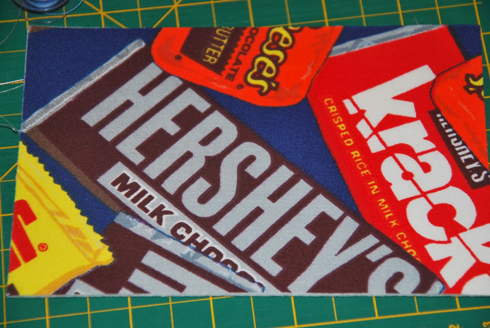
Lots of top stitching.  I used a grey embroidery thread to emphasize Hershey's.  I started at the bottom of the H and continued across not cutting the threads between each letter, instead, I used a brown sharpie marker to colour the grey thread between letters. You can spot just a dot of grey between the bottom of the E and the R.   This card has been mailed out to ?

 
I use an embroidery foot to free hand most of the stitching,  for some of the longer straight lines  I use the regular foot and the feed dogs to more the card.

 
This is such a nice print, that it really didn't need much.  I used black thread to outline various aspects of the shoes and grey for the balls.

 
Years ago, I made a pillow case with this fabric.

 
I used some ideas from Zentangles to fill in the stars.  Yellow, orange, green and red threads were used.

 
I was given a piece of this fabric that a friend had left from a quilt.  it's shown up in a few of my craft items over the years.

 
I wanted to emphasis a few of the features.  I used a thread painting technique to over stitch the heart, the alien, and the word love.  I also re-embroidered around the word whatever.  It used to be the bright blue that shows in the middle of the letter a.


Monday, February 3, 2014

Nancy Drew: Secret of the Old Clock - and a contest

When I was much younger, I read every Nancy Drew book that I could get my hands on. A few were borrowed from my older sister, and the rest from various friends or the libraries.  Recently I came across a wonderful set of postcards showing the images of the covers of the first 30 books in the series.  I have posted a review of Nancy Drew: 30 Postcards on my blog Books and Quilts. When you visit to read my review, be sure to read to the bottom where you'll find instructions on how to enter my contest to have one of these cool postcards mailed to you.
 
I have mailed this card to that sister.
 
This is the 3rd card I have sent for my Month of Letters.


Paisley Power

Paisleys are wonderful. There is so much you can do with them.  One of my Zentangle friend's challenged a group of use to tangle some of them.  Since it was a loosely defined challenge, I thought I would try and stitch mine. I wrote about it on my other blog, Books and Quilts.  I'll also post the photos here.

Most postcards I start right in on the stitching, but this required some pre-planning and a couple of sketches.  Not all tangles can be done successfully on the sewing machine, but those continuous line ones work perfect.
 
Last year I cut fabrics for several floral quilt projects and had a bunch of equal size strips remaining.  I sewed them together and set them aside.  They worked perfect for the background for my first attempt.  The black stitching barely shows up.  I stitched on the fabric and the thick layer of interfacing.  Since it already had the fusible on the back, I found it a bit difficult to manipulate and move smoothly.  I'll have to try some other arrangements and see if I can an improve on that.


I was hoping that changing to pink thread would help with the visibility, but it didn't really work. A more drastic approach would be needed.


Pink fabric and black thread.  Now it really shows up.  This time I decided that I would use one tangle for the inside of the paisley.  I'm happy with how this turned out.
 
I thought the stitching might be more visible taking the picture on an angle. As you can see in the next two photos, it did help a bit.  A big advantage of these little projects is that if something doesn't work, I can still finish the project and quickly move along to the next variation.  


Sunday, February 2, 2014

Postcards from pre-printed fabric panels


Today's set of postcards started with a purchased panel.  Actually it was a width of fabric strip that I purchased for about $3.00. It was badly printed, skewed and printed right into the selvedge.  It was also much smaller than a standard postcard size.  |A bit of improvising would be needed.
There were also pieces for the back, but again, they were too small, so I set them aside for a future project. 
 
One of the pieces shown on top of a 4 x 6 inche piece of thick interfacing.
 
Simply set with a strip of fabric on each side.  I purposely set the panel off square so it would be obviously skewed. A little bit off square would make a viewer think I made a mistake, where as being off square by a larger margin looks as though it was done on purpose.

 
Really set off square.

 
To me, the words slanting downward is more pleasing, but I wonder if a right handed person would consider the words slanting upward more pleasing.


This time, I moved the panel to the top of the interfacing and added fabric to three sides.  The bottom strip was trimmed from and earlier postcard.


A little more play, moved this panel to the upper right corner requiring only strips on two sides.  Unfortunately when this one was designed, the paint for the working was a pale pink that hardly showed up.  I used a Pigma pen and coloured it a darker pink. Very effective.  Check the first photo in this post and you'll see the difference.
 
As part of  "A Month of Letters", I'll be sending one of these cards to a quilting friend.